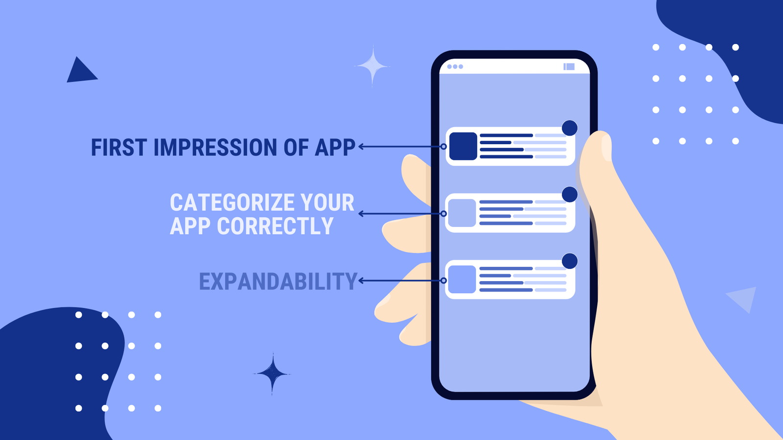
In today’s era of mobile technology, having an app is crucial for every business or organization. With millions of apps available in app stores, it can be challenging to make your app stand out. One way to grab users’ attention is by designing a catchy app icon. A well-designed app icon can draw users toward your app and make it stand out from the rest. In this blog, we will discuss some tips and tricks for designing a catchy app icon in 2023. The app icon is one of the branding elements that seems to be small; however, the app icon should be created in a way that can attract users at first glance; the app icon must stand out from the other icons, narrate the core of your app, and it must be easily recognizable and memorized.
“App icons should be designed noticeably, portray the app’s whole idea, and be eye-catching!”
Table of Contents
- What is an App Icon?
- 1. Employ a unique shape or symbol
- 2. Create it Simple
- 3. Exclude words
- 4. Pick Lively Colors
- 5. A/B testing for different versions
- 6. Maintain the Brand
- 7. Try not to overload the icon with color and detail
- 8. Analyze your competitor’s app icon designs
- 9. Presenting your App’s Look and Sense
- 10. Create a Recognizable App icon
- Conclusion
What is an App Icon?

Straightforwardly, an app icon is a graphic thumbnail on the desktop, in the list of the menu of your phone, or in the app store, allowing you to open an app with just a single touch. Various icons vary in brightness, shape, and logos. Mobile application icons are simple and clear. While designing the app icon, consider that your app symbol must be simple and pleasant for the user.
App icons in no way influence an app’s functionality; they provide easy access to your app. There are a few highly critical and technical applications for these apps; icons don’t matter, that is the fact. However, app icons are one factor that exhibits an app’s necessity. It’s highly needed for your app to stand out in the multiple programs on the user’s device. It’s a challenging task to design an app icon that is simple yet attractive. Summarizing all these aspects in a small app icon is a bit of a challenge; here a few tips and tricks are explained, which can help you create a stunning app icon and help you to higher the conversion rate.
“Associate with AoneApps and our experts will create the perfect unique icon for your app!
1. Employ a unique shape or symbol
Consider the platform your app has developed, and select the shape accordingly. For iOS, all icons are in the same square format, but for Android, an experiment in the shape is possible. The unique symbol can be employed as a logo of your app or company.
2. Create it Simple
Almost all icons of popular apps are possibly simple. There is no need for high innovation and applying different tricks. Spare them aside to create the app models. While considering the app’s image on the desktop should be decreased to one or two noticeable elements.

3. Exclude words
It is necessary for an app icon to be understood by itself. The age-old proverb “a picture is worth a thousand words” goes hand in hand when creating an icon for your app. Icons are usually better perceived when they do not contain any words. They tend to generate more clicks and are less confusing.
4. Pick Lively Colors
To design a good app icon, make sure that the colors align with your brand. Take the time to think about how to make your icon stand out in the search results. Bright colors can help an app attract the user’s attention. Don’t use too many colors either – one or two main colors should be enough. Simple app icons drive much more conversion than complex ones. In this example, we see many apps have used bright colors to stand out amongst competitors. Another way to choose the colors for your app icon is to reflect on your brand colors.
5. A/B testing for different versions
Some experts can manage to create the ideal application icon in the first trial. That is why our experts at Aoneapps decide on all the defects before launching the app. Also, we suggest testing various versions. Analyze how they emerge for various operating systems. Find out if it is easier to find the icon among similar apps. Employ multiple marketing tools for the testing. Your app is already designed and launched in a way that will give you a pop-up for the update. It will be an added advantage. Few of the popular professional icons occasionally improve, so it’s a common practice to improvise app icons periodically.
6. Maintain the Brand
The app and its icon color should be consistent; for example, the Spotify App has green and black in the app. The app has a black home screen with green text and a play button. Employing a matching color range creates a fusion between the icon and the platform. It’s an integrated journey for the user. There is no rule that the colors always have to be the same, but using the app’s color in the icon will generate a positive user experience.
7. Try not to overload the icon with color and detail
There are many tips to create app icons that are more primarily attractive, suggesting the ‘SIMPLICITY OF ICON’; however, it should be more focused. Mentioning more details on the app’s icon will complete the user’s perception. Therefore, focus on a critical element of the app and express it on the icon, which will indeed narrate the app’s detailed story.
8. Analyze your competitor’s app icon designs
There are millions of apps in the market store with similar services; notice if your competitor has modified their app icons, and analyze how and why they make changes in the app icon. Analyzing competitors’ icons will surely help determine which app has a high conversion rate in the market. This will lead you to get new ideas, and you can apply them to your app icon. In addition, it will add knowledge from other company’s experiences. Studying the competitor’s icon will be a new inspiration and give you new ideas and an opportunity to avoid blunders in creating an app icon. You can analyze minor details and determine which logo is more suitable as an app icon that needs to be changed. This way, opponents are also a source of inspiration!
9. Presenting your App’s Look and Sense
It is tough to present the app’s look and feel; however, it is necessary to explain it very well. The app icon design necessarily matches the function and benefits of the app. The app icon is the most accurate way to convey a precise message and action visually. Give the best efforts to form a chain of associations. In another way, your app’s icon must match the brand’s color and the company’s goal. To get a perfect idea, you can conduct a round of discussions with your known people who can tell you how much they can relate to the app with the icon. The user always remembers the icon. It’s a task that needs concentration with the expectation of a designer who can create an app logo, which will help you communicate with your prospective customer. It’s a slightly challenging and not easy task; however, dedication and your perfect app icon can be an extension of your communication strategy with your users.
10. Create a Recognizable App icon
Today’s need is to survive in the competition and create a valuable space within the market. Study well the app icon of a successful app. The icon, which is easier to recognize and narrates the app’s story, would have a higher conversion rate on all platforms. The designer’s creativity and the task are to form an icon that is most memorable and recognizable among your competitors. To achieve great success in creating decent app icons, always focus on the design and correlation with the brand.

Conclusion
In conclusion, designing a catchy app icon in 2023 requires a combination of creativity, simplicity, and uniqueness. By following the tips and tricks outlined above, you can create an app icon that stands out from the rest and attracts users to your app. Remember to test your design, maintain consistency, and continuously improve your app icon to keep up with changing trends and user preferences.


